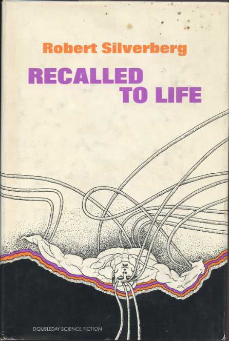
(Cover for the 1972 edition of Recalled to Life (1958), Robert Silverberg)
“I think the 60s and 70s were probably one the most creatively interesting periods for everyone. Art, music, film all pushing the envelope. New York City was affordable and fun, fertile in its influences. Book cover art, book jacket art was fun concept art, a bit more free than other illustration work” — Emanuel Schongut
Back on May 19th, I showcased Emanuel Schongut’s 1960s SF covers [link]. His nephew found my post and put me in touch. Over the last few weeks I have had a wonderful discussion via email about his time creating covers for Doubleday under the direction of Margo Herr (art director + cover illustrator/artist). Emanuel graciously agreed to a short interview. He gives a behind-the-scenes look at SF cover illustrating in the 60s/70s, reflects on his own career, and discusses his artistic process. If you have any questions, I will be more than happy to relay them to the artist.
Also included after the interview is a delightful selection of his 1970s covers–a double post! I also recommend visiting his online portfolio for his more recent non-SF work.
As always, thoughts and comments are welcome.
Enjoy!
Note: I have made only minor edits for clarity and inserted publication dates where necessary.
Interview
Thank you so much for agreeing to do an interview on your 60s/70s science fiction covers. Over more than two decades of producing SF covers for Doubleday, you put together an impressive body of work. They graced novels by some of the most esteemed authors of the genre, including Kate Wilhelm, John Brunner, Clifford D. Simak, Robert Silverberg, Keith Laumer, among others.
1) First, can you say a little about yourself.
Thank you for your interest Joachim.

1967 edition of Zenna Henderson’s The People: No Different Flesh (1966)
I was born and raised in New York state about a hundred miles from New York City. After high school graduation I studied art at Pratt Institute in Brooklyn, earning a BFA and MFA. Graphic arts and illustration was my major. Richard Lindner, an artist sadly neglected these days, was an important influence. I emerged with a portfolio of etchings, not very practical for a career in illustration. I stayed on at Pratt as an assistant instructor to illustrator Tony Saris for 6 or 7 years. It was the early 60s and I learned a great deal from the students who had a greater sense of freedom about their work. During this time I was able to work on some more practical portfolio samples. I never was very aggressive about looking for work but in those days it was easier to see art directors. I soon had enough work to quit teaching and concentrate on a variety of illustration venues working in pen and ink, watercolor and pencil.
Push Pin Studios represented me in the early 70s giving me a bit more status. By the 80s I was burnt out with illustration and New York City, and moved back to upstate New York still keeping a few clients. New York weather finally drove me to California and San Francisco. I now prefer to work on my own projects, a group show last October, another coming up in November, and a bit of teaching. I will occasionally take a job if I find it interesting. I designed a mural for the exterior of an American Apparel store in Williamsburg Brooklyn a few years ago which was enjoyable.
Over the course of the 1960s and 1970s you illustrated a wide range of non-fiction and fiction covers–from fashion spreads in New York Magazine to Clinical Studies of Personality, volume 1. Personality Disorders in Adults (1966), from Perennial Library’s 1972 edition of Aldous Huxley’s Islands (1966) to the young adult / post-apocalyptic The Sword of the Spirits trilogy by John Christopher of The Tripods fame. How did you get involved with cover illustration and Doubleday’s SF line in particular?
I started doing book covers early on for a Pratt friend who was an art director for Collier Books mystery paperbacks. I really knew nothing about the process. The artist was responsible for illustration, design, typography, and color separation. Book club and other book covers were printed in black and two colors. Another Pratt friend helped with the type and taught me how to do a paste up and mechanical. I had three or four printed samples of book covers and started calling publishers for appointments.
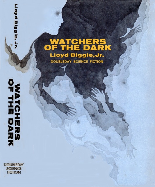
1966 edition of Lloyd Biggle, Jr.’s Watchers of the Dark (1966),
Margo Herr, an art director at Harper and Row, was the first to respond. I did a series of covers for her for a range of paperback books from scholarly to classic. Margo and the editors pretty much gave me the freedom to explore concept and design. After Margo left to go to Doubleday I continued to work with art director Pat Steir, and later Karen Sukoneck with the same degree of freedom.
I have long been a fan of Doubleday’s avant-garde art–especially your evocative illustration for the 1966 edition of Watchers in the Dark by Lloyd Biggle, Jr. Can you talk a little about working with Margo Herr, Doubleday’s art director and also a prolific artist/cover illustrator in her own right?
Margo Herr was a terrific art director, artist, and an even better friend. We had developed a great working relationship at Harper and it was an easy transition to Doubleday. I don’t know how the avant-garde art concept came about, it seemed to be a particularly fertile time period for experimentation, Pop art, Psychedelic art. Alex Gotfryd was the design director who had hired Margo and trusted her judgement and most of the editors were agreeable. The Science Fiction and Crime Club book clubs were part of Margo’s responsibilities. If they were interested in a more typical pulpy type cover art they would not have hired me.
I think the fact that the covers were printed in black and two colors readily adapted to something more graphic. Composition and color combination could add to a atmospheric or psychological effect. My work with Margo at Harper and Row had been going in that direction and we further explored it. Eventually I did some full color covers and some children’s book work for her. I think Margo Herr was most influential in allowing me to grow as an illustrator.
You mentioned briefly in a comment on my showcase of your 1960s SF covers, that this period of your career was “one of the most creatively interesting and fun.” Can you expand on that idea?
I think the 60s and 70s were probably one the most creatively interesting periods for everyone. Art, music, film all pushing the envelope. New York City was affordable and fun, fertile in its influences. Book cover art, book jacket art was fun concept art, a bit more free than other illustration work.
Also, you indicated that you enjoyed having “the excuse to spend time reading the books.” A lot of artists from the period producing SF art clearly did not read the book or sent in art that editors placed on various books indiscriminately. Can you tell me about your process creating a cover? Do you remember enjoying any of the novels in particular?

1965 edition of All Flesh is Grass (1965), Clifford D. Simak
Reading was always a great joy for me so being paid to read a book was even better. The important thing about reading the book was that I could not be accused of putting something in the cover art that was not in the story. Also it gave me a framework, and a feeling for atmosphere. I would read the book mostly in unbound paper galley proofs. Then spend some time rough sketching ideas either based on some part of the story or a general feeling about the story. Eventually something would gel, maybe in bits and pieces. Sketching the bits and pieces on tracing paper first I would arrange them till I had a suitable composition. Next would be a series of refining tracings always keeping in mind space for title. author, etc. When I had a tightly traced drawing with a selected typeface or font I would submit it to the art director and editor along with some color suggestions. After approval I would trace the image on to watercolor paper. This would be the black base plate usually painting with tones of black watercolor. The rest was the less satisfying acetate layers of color and title for mechanical.
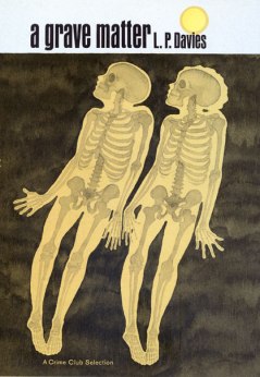
1968 edition of A Grave Matter (1968), L. P. Davies
I think I enjoyed reading the novels of L. P. Davies most. His novels were in both the SF and Crime Club categories sometimes a crossover in each. A kind of mystery, phantasy, psychological aspect to each. He asked for me after the first cover and I did his covers for both SF and mystery till I stopped doing covers. He is not quite traditional, you may not like him but you should try a read.
Do you have a favorite SF cover of yours from this period?
My favorite cover I think is for The Night Spiders (1967). A close second is Froom (1966). Coincidentally both books are by John Lymington, Froom is I believe my first for Doubleday, but my memory is a bit fuzzy.
Thank you!

Emanuel Schongut covers from my own collection. First editions: Midsummer Century (1972), Silence is Deadly (1977), The Downstairs Room and Other Speculative Fictions (1968), and Turned Loose on Indra (1970)
A selection of Emanuel Schongut’s 1970s SF covers

(1978 edition of The Masters of Solitude (1977), Marvin Kaye and Parke Godwin)

(1977 edition of The Silence is Deadly (1977), Lloyd Biggle, Jr.)

(1972 edition of Midsummer Century (1972), James Blish)
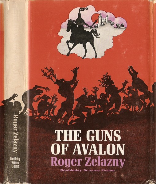
(1972 edition of The Guns of Avalon (1972), Roger Zelazny)

(1971 edition of Abyss (1971), Kate Wilhelm)

(1973 edition of Conscience Interplanetary (1972), Joseph Green)

(1970 edition of Genesis Two (1969), L. P. Davies)
 (non-SF cover. 1976 edition of The Forespoken (1976), Betty Levin)
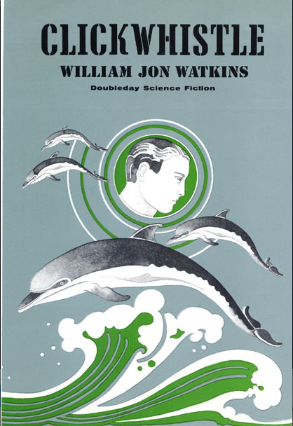
(1973 edition of Clickwhistle (1973), William Jon Watkins)  (1971 edition of Give Me Back Myself (1971), L. P. Davies)
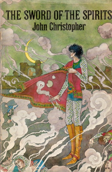
(1972 edition of The Sword of the Spirits (1972), John Christopher)

(1972 edition of Hawkshaw (1972), Ron Goulart)
For more cover art posts consult the INDEX

Beautiful and thought-provoking covers. I somehow don’t think we’ll still be discussing modern offerings 40/50 years from now…
My hope is that John Harris is remembered. He has a unique impressionist style of space and SF that I love looking at.
Absolutely!
I get the impression that lots of people like modern space opera cover art, etc. Modern covers, as all covers, do respond to the market in many ways….
And unfortunately, the surreal experimentation of a lot of 60s/70s SF art has faded away.
And I like a lot of it – don’t get me wrong. But there simply isn’t the range and experimentation there used to be. I’m guessing it’s as science fiction is becoming evermore mainstream.
I now know what makes artists like Emmanuel Schongut so superior to so many lesser artists who produce mediocre covers.They only see what they did as commercial ventures.What they were doing wasn’t what they thought of as art.I know some British paperback artist,whose name I don’t remember,saying that he got nothing from seeing his work on the cover of a book.He got more satisfaction from the cheque.
Clearly,Schongut views his work in a non-financial mode.It’s purely creative.He tries to view the purpose of SF covers as creative.In doing so,he’s pushing the boundaries of graphic art far beyond that of commerciality.He is being almost entirely cerebral in his approach.
Those 1960s covers look so modern even now.He was so very far ahead of his time.
I am glad you enjoyed the interview!
Yes I did,as well as the covers.They’re of the sort you can’t take eyes away from.I can well understand the seriousness he brings to an artform that has been treated so cynically in the past.
Mr. Fahey,
You are spot on. Mr. Schongut’s work has always been inspired by a love for the visual experience. He is a master watercolour artist. There are many who make a distinction between illustration and art. E.S. crosses that boundary. I strongly suggest looking at his flickr site (Thanks for the link Joachim). It includes Posters, Children’s books, magazine and newspaper work etc etc. A gift to us from a gifted man.
That’s really what I meant.SF covers in the past have been seen too much as commercial ornamentation.
Fascinating interview and great covers – thank you for sharing these with us! Particularly interested to see the Zenna Henderson cover – I have picked up a couple of her titles as I have vague memories of having seen a TV movie of one of her stories back in the 1970s!
I have a collection of Henderson’s stories on the shelf somewhere. But, the “precocious children with special powers” type of SF has never been that appealing to me…. They are supposed to be great! I’ll read them, eventually….
I remember many of those! Nice to hear more about the creator!
Fred, thanks for the comment! I’d love to see which covers of his you have in your own collection!
A word that comes to mind, especially for The Masters of Solitude and The Guns of Avalon: “Celtic.” The image of those antlered creatures (hybrid creations or simply humans wearing antlers) brings to mind Celtic fertility rites – Bealtaine (May 1).
I wonder how much of that is rooted in the book… I purchased a copy of The Masters of Solitude recently. I know little about it.
I think they are still to this day seen as commercial ornaments. I think we have to be careful about casting out that idea entirely, presses certainly went with particular images (often striking/avant-garde or scandalous) to sell books… That’s a key part of what the cover is for! That doesn’t mean you can’t produce good art. That doesn’t mean the art director of a press can’t gather interesting artists that fit their idea of what should be the image of their press.
Doubleday had an image and Schongut fit that image and also helped mold it. We can’t ignore the commercial elements of cover design. Rather, we should praise the artists who still managed to produce amazing art that could stand on its own.
And art directors such as Margo Herr at Doubleday who allowed artists, such as Emanuel Schongut, quite a lot of freedom.
I’ve no doubts at all as to what you say Joachim.I just think that Schongut is exponential in pushing the boundaries of what has been seen as another form of commercial advertizing.He’s quite a maverick in a brutally competitive field.The artists themselves though,as I’ve said,are just as much to blame for this philistinal attitude.
Not sure either, though the “Avalon” reference in the Silverberg book matches up well with those antlered folk.
He did say he reads the books… So, I bet it does reference the novel — and, it is some post-apocalyptical type story. Perhaps there’s a “celtic-esque” religion.
I daresay in some cases the cover art may be better than the story behind it. (Looking at you, Guns of Avalon.) 🙂 Great interview!
Was the Zelazny novel really bland in comparison to his other stuff?
Thank you for the kind words!
Fantastic post. Wish you could interview all the artists you love. I’ve owned a number of these books, so it’s fascinating to hear from the author of their covers.
Yeah, I’d love to interview Powers! If he were still alive 😦
Thank you for the kind words!
Very good interview! I’ve worked in publishing for years and like these behind the scenes histories and learning about the artistic process as well.
Also, I read Blish’s ‘ Midsummer Century’ way back in high school entirely based on my liking this cover.
Remember anything about the book?
There’s an emphasis on philosophy and consciousness, as the main character is sent ahead in time, but it’s only his mind that has been sent. The cover refers to advanced species of birds that are trying to eliminate the few remaining humans left on Earth.
I think I remember it because a girl in my class was reading it at the same time. We had to pick a Sci-fi book and then write a report. She picked this one since it was the shortest Sci-fi book she could find!
Ah, when I was in school we could only pick books from a set list… (or get approval but the teacher rarely knew what the book was which we selected and tended to force us to use the list).