
(Arthur Hawkins’ cover for the 1959 edition of Skyport (1959), Curt Siodmak)
Part II of my series on cover art depicting space stations (Part I). Here are vast assortment of primarily Alex Schomburg and Vincent Di Fate’s artwork — they did love their space stations. But, I think my favorite is by far Arthur Hawkins’ cover for the 1959 edition of Curt Siodmak’s Skyport (1959) — the author is of course famous for the novel Donovan’s Brain (1942). The delightful color scheme, the 50s aesthetic, the vague indication of continents below, the cluster of stars…. Wonderful!
I’ve decided to include a few German and Italian editions of Arthur C. Clarke and Lan Wright… Karel Thole, a Dutch illustrator, has long been my favorite of the foreign science fiction artists. I might do a post on his English edition covers (mostly in the 70s) — there are a handful and some are quite stunning.
As for the books (and magazine volumes) below, I’ve read Clarke’s Islands in the Sky (1952) and Space Cadet (1948) — both were fun juveniles — but that’s about it… Are their any gems?
Enjoy!

(Alex Schomburg’s cover for the November 1961 issue of Amazing Stories)

(Vincent Di Fate’s cover for the 1981 edition of Islands in the Sky (1952), Arthur C. Clarke)

(Uncredited cover for the 1977 edition of This is the Way the World Begins (variant title: Ruler of the World) (1976), J. T. McIntosh)

(Uncredited cover for the 1955 edition of Adventures on Other Planets (1955), ed. Donald A. Wollheim)
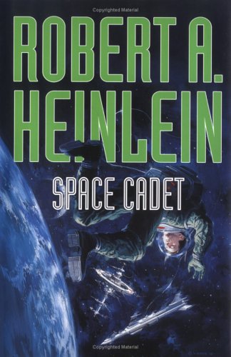
(Vincent Di Fate’s cover for the 2005 edition of Space Cadet (1948), Robert A. Heinlein)

(Alex Schomburg’s cover for the April 1980 issue of The Magazine of Fantasy and Science Fiction)

(Uncredited cover for the 1958 issue of Space Station 42 and Other Stories)

(Davis Meltzer’s cover for the 1980 edition of Unisave (1980), Axel Madsen)
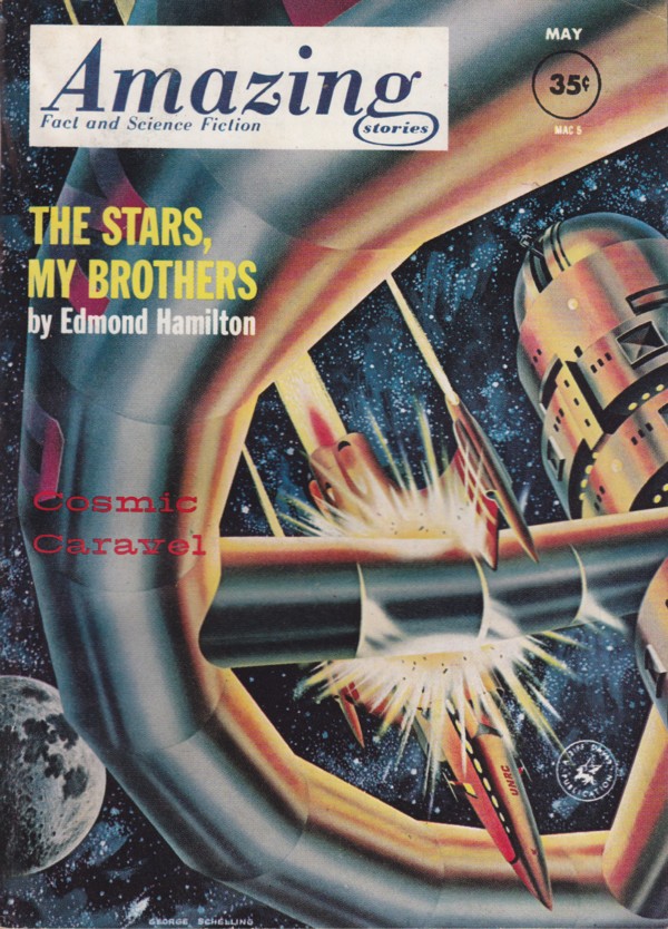
(George Schelling’s cover for the May 1962 issue of Amazing Stories)
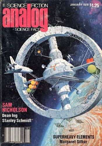
(Alex Schomburg’s cover for the January 1978 issue of Analog Science Fiction Science Fact)

(Uncredited cover for the 1963 edition of Islands in the Sky (1952), Arthur C. Clarke)

(Vincent Di Fate’s cover for the 1974 edition of Continuum 3 (1974), ed. Roger Elwood)

(Uncredited cover for the 1975 edition of City in the Sky (1974), Curt Siodmak)

(Alex Schomburg’s cover for the January 1953 issue of The Magazine of Fantasy and Science Fiction)

(Darrel K. Sweet’s cover for the 1979 edition of The Two Faces of Tomorrow (1979), James P. Hogan)
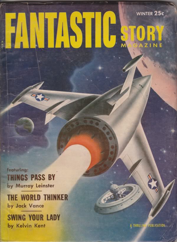
(Alex Schomburg’s cover for the Winter 1955 issue of Fantastic Story Magazine)
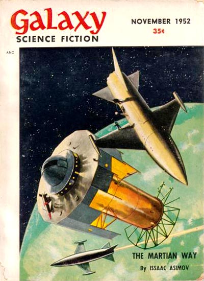
(Jack Coggins’ cover for the November 1952 issue of Galaxy Science Fiction)

(James Stark’s cover for the Number 17 (1956) issue of Nebula Science Fiction)
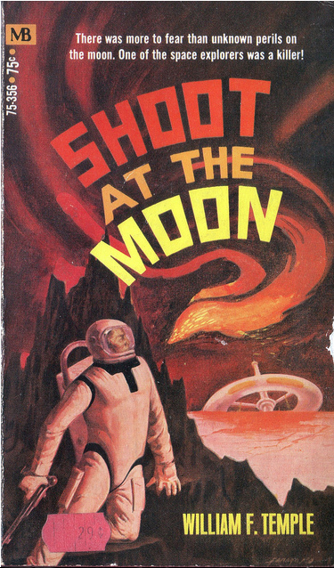
(Jack Faragasso’s cover for the 1970 edition of Shoot at the Moon (1966), William F. Temple)

(Alan Gutierrez’s cover for the 1983 edition of The Lagrangists (1983), Mack Reynolds)

(Richard Powers’ cover for the 1958 edition of The 27th Day (1956), John Mantley)

(Karel Thole’s cover for the 1979 edition of City in the Sky (1974), Curt Siodmak)

(Karel Thole’s cover for the 1966 edition of The Last Hope of Earth (1965), Lan Wright)
 (Non-fiction but fun — Bernhard Borchert’s cover for the 1955 edition of Young Traveler in Space (1954), Arthur C. Clarke)
For similar posts consult the INDEX

My favorite is the Alan Gutierrez’s cover, but the Davis Meltzer’s artwork is really nice too.
Yeah, we have much much much different aesthetics — I find those (very 1980s) by far (well, along with Darrel K. Sweet’s cover) the weakest of the bunch 😉
I don’t know. The Skyport one is really awesome, but I do like the Powers as well. And am always happy to see work by Vincent di Fate.
Yeah, I love the Skyport image — the colors and composition is perfect! But yes, always love di Fate although I prefer his more surreal compositions.
That Asimov title (“Nice Guys Finish First”) threw me as I couldn’t think of a story meeting the description. But it appears to be one of his monthly science essays, on society, which … doesn’t actually pin it down for me, but I haven’t read most of his essay collections in a long while.
Unisave looks interesting to me, but I have a weird fondness for overpopulated or city-universe dystopias from that era and the cover really screams late 70s in a delightful way.
I love the overpopulated dystopic visions as well — I have an entire list on this site — you might have already looked at it.
https://sciencefictionruminations.wordpress.com/science-fiction-book-reviews-by-author/sci-fi-novels-about-overpopulation/
If you have any to add let me know!
However, Unisave is supposedly awful — here’s a review.
http://theporporbooksblog.blogspot.com/2011/07/book-review-unisave-by-axel-madsen-1-5.html
This kind of cover art has long been appealing. Thanks for posting!
Thanks for visiting. Do you have a favorite cover from the bunch?
Rather than a favorite there are some which my imagination is saying it would be fun to have as 1960s plastic model kits by Revell,starting from top of page they are:
Reblogged this on Undecided Title (includes hobbies and health and stuff) and commented:
Cover art like this is appealing. Found this while looking for something else; some interesting things get found that way! Ah, the post says there are several more parts in the series.